Color Theory for Bag Making: A Comprehensive Guide
Being a passionate bag maker, I’m fascinated by how color works. The right colors can enhance our designs, stir emotions, and show our brand’s identity. Choosing the right colors is more than just making things look pretty. It’s about using color smartly to make your bag creations amazing works of art.
This guide will get into color theory for everyone who loves creating bags. We’ll cover how colors relate and ways to use them for beautiful, well-matched bag designs. You’ll learn about primary and secondary colors, as well as the warmth and coolness of hues. This knowledge will help you make smart choices and create bags that people love.
Key Takeaways
- Color theory is a crucial element in bag making, as it can significantly impact the overall aesthetic and appeal of your designs.
- Understanding the fundamentals of color, including primary, secondary, and tertiary colors, as well as warm and cool hues, is essential for creating visually stunning and cohesive bag designs.
- Leveraging strategic color combinations, harmonies, and schemes can help you elevate the aesthetic appeal of your bags and connect with your target audience on a deeper level.
- Incorporating the principles of color psychology and cultural influences into your bag-making process can further enhance the emotional resonance and appeal of your creations.
- Mastering color theory is a powerful tool that can elevate your bag-making skills and ensure your designs stand out in the competitive marketplace.
Let’s explore more! We’re going to unlock the secrets of color theory. With this knowledge, you’ll create bags that not only wow people but also stay in their minds for a long time.
Understanding the Basics of Color Theory
The core of color theory is the color wheel, a circular map of primary, secondary, and tertiary hues. Primary colors are red, yellow, and blue. They’re the basis for all other colors. By mixing these, you get secondary colors like purple and green. Tertiary colors are mixes of primary and secondary hues, such as red-orange.
Colors are also divided into warm and cool tones. Warm shades like red and orange bring energy and excitement. Cool tones like blue and green create a calming feel. Mixing these effectively is key to making your bag designs stand out.
Primary Colors
The primary colors are the starting point. They are necessary for creating all other colors. Red, yellow, and blue form a foundation for many beautiful schemes and combinations in design.
Secondary Colors
When you mix two primary colors, you get secondary colors. These include orange, purple, and green. They add vibrancy and choice to any color scheme, making designs more lively and engaging.
Tertiary Colors
Tertiary colors are mixes of primaries and neighboring secondaries. They include hues like red-orange and blue-green. These shades add subtlety and depth. They make your designs more nuanced and interesting.
Warm and Cool Colors
Warm and cool colors each have their own mood. Warm colors, from red to yellow, have an upbeat feel. Cool shades, from blue to purple, are more relaxing. Knowing their effects helps you choose the best colors for your bags, fitting your brand or appealing to your target market.
Choosing Colors for Bag Making
In bag design, picking the right color is key. You can use different colors to create many effects. By mastering color combinations, you make bags that look great and stand out.
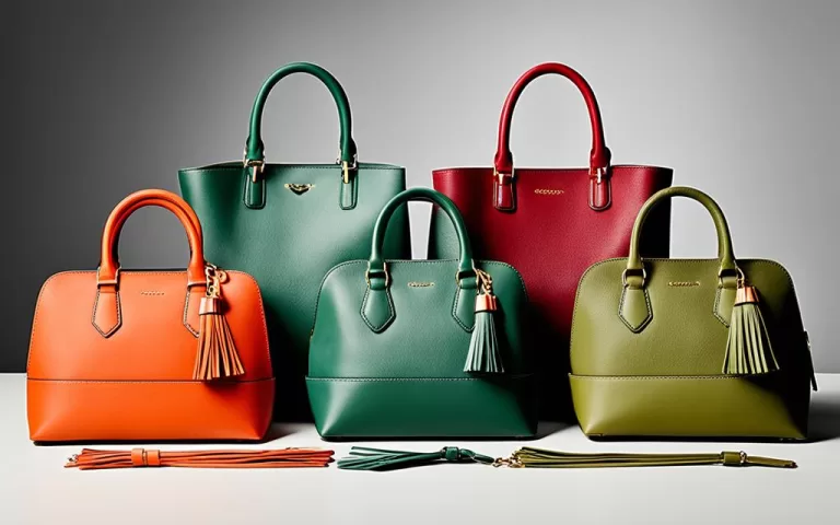
Complementary Colors
Complementary colors sit across from each other on the color wheel. They bring out a strong contrast. This makes your bags catch the eye with a punch. It can work wonders for bags meant to be bold or unique.
Analogous Colors
Analogous colors are next to each other on the wheel. They blend to give off a harmonious vibe. This helps your bags show sophistication. It’s also great for making a collection that looks like it belongs together.
Triadic Colors
Triadic colors are evenly spread on the color wheel. They add balance and energy. They make your bags look lively, perfect for a younger crowd. This scheme also creates a fun look that stands out.
By knowing how to use these color schemes, you can make bags that look amazing. They not only captivate but also show your brand’s special style.
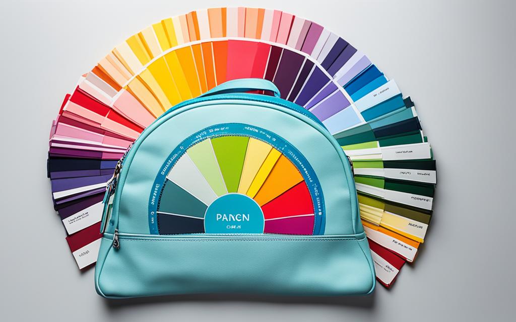
Color Harmonies and Schemes
Beyond simple color combinations, there’s a whole world of color harmonies and color schemes. Color harmonies are specific arrangements of colors. They create a beautiful and united look. You might know of monochromatic, analogous, complementary, and triadic color schemes. Knowing about these color harmonies helps you make well-thought-out color palettes. This is key for creating bag designs that are both coherent and eye-catching.
| Color Harmony | Description | Examples |
|---|---|---|
| Monochromatic | Uses various shades, tints, and tones of a single color palette | Shades of blue, varying tints of pink, different tones of gray |
| Analogous | Uses colors that are close on the color wheel. This creates a smooth and pleasing color scheme. | Yellow-orange, orange, red-orange; blue, blue-green, green |
| Complementary | It pairs colors that are opposite on the color wheel. This makes a bold, lively color palette. | Red and green, blue and orange, yellow and purple |
| Triadic | It combines three colors that are evenly spread out on the color wheel. This gives a vibrant, balanced color scheme. | Red, yellow, and blue; orange, green, and purple |
Color Psychology in Bag Making
For bag makers, understanding color’s impact is key. Colors can evoke feelings, match certain styles, and represent brands. Knowing this, you can design bags that really connect with people.
Color and Consumer Perception
Colors affect how your bags are seen. Warm colors like red signal energy and passion. On the other hand, cool tones can make people feel calm and trusted. By using colors that fit your brand and the emotions you want to evoke, you’ll stand out.
Choosing Colors for Different Bag Styles
The colors of your bags should match their style and use. A sleek tote bag might look best in simple black and white. A fun crossbody, on the other hand, could shine in bright colors. Understanding color psychology helps match the right colors with each bag, improving customer satisfaction.

Color Theory for Bag Making
Using color theory for bag making can make your designs stand out. It helps designers and craftspeople understand how colors work together. They learn about color psychology and different schemes and harmonies. This knowledge can make your bags visually appealing and align with your brand.
Learning color theory for bag making teaches you to mix colors well. You’ll understand how to make color schemes that work together. This broad knowledge will make your bag designs more unique and attractive.
Understanding color theory for bag making is key to making exceptional bags. It’s a way to ensure your bags not only look good but also say something about your brand. With the right use of color, your bags can really capture your audience’s interest.
Fabric Selection and Color Combinations
The right fabrics and colors are key when making bags. Choosing the right fabric color selection for your customers’ skin tone is important. This makes the bags look personalized and more attractive. It’s also smart to keep color families together.
For example, pastels should go with pastels. Jewel tones should be with other jewel tones. This makes the design look like one complete idea.
Matching Colors with Skin Tones
It’s important to know which colors match with your customer’s skin. Certain colors can make someone’s skin look better or worse. It’s key to think about this when choosing bag colors.
Keeping Color Families Together
Using the right colors together in bag making makes bags look better. Stick with pastels or jewel tones in your designs. This makes the bags not only pleasing but also stands out to people.
Matching Materials and Colors
How you match fabric with color schemes is very important. Some fabrics look better with certain colors. Knowing this helps create bags that look stylish and appealing.
When you get these color techniques down, your bag designs will shine. Customers will notice and love your unique bags.
Branding and Color Consistency
Color is key in branding. It’s vital for your brand’s image. When making bag designs, pick colors that fit with what your brand is about. Using the same colors in all products and ads makes your brand more easily recognized. It also looks neat and put-together.
Maintaining Brand Identity with Colors
Strategically using colors in your bags and ads is smart. It helps show what your brand stands for, reach your customers, and make your stuff stand out. Keeping the same colors on all bags makes your brand stand out. People can spot your products from a mile away.
Consistency in Product Lines
It’s a big deal to keep bag colors the same in all your collections. This shows customers what to expect from your brand. It also makes your brand look strong and your customers happy. They know what they’re getting, which is a good thing.
Cultural Influences on Color Choices
Understanding the cultural color associations and color and cultural significance worldwide is crucial when creating bags for everyone. A color that brings luck or is popular in one place may not be the same elsewhere.
Researching the international color preferences for bags helps you know what people like. This knowledge lets you pick colors that touch your customers on a deeper level. Your bags can then better show their cultural taste and choices.
Using color smartly can help your bags stand out and feel close to people’s hearts. By choosing colors that mean something to the people you want to reach, your bags become more desirable. This can lead to more people buying your bags and loving your brand.

Conclusion
Color theory is a top skill for bag makers. It lets you weave together colors in a way that stands out. By grasping the basics of color, like primary and secondary colors, you can make your bags look amazing.
Also, understanding how colors affect people can make your bags more engaging. Mastering color theory is key to making your products shine in a busy market.
Exploring color for your bag line means not just picking shades. It’s about creating products that shine and connect with buyers. Using color theory for bags opens up endless design possibilities.
Source Links
- https://www.bizongo.com/blog/packaging-color-psychology
- https://www.applegreencottage.com/sewing-bags-and-bag-making-tips/
- https://ivyandpearlboutique.com/blogs/fashion-howto/fashion-colors-matching-clothing-colors-using-color-wheel
- Color Theory Part 1: Introduction to Color Theory in Packaging (foxbag.com)